An article on the RTINGS website entitled ‘The Waterfall Illusion: How Analysis Parameters Can Overshadow Acoustic Truth In Headphones CSD Plots’ (here) offers up cumulative spectral decay (CSD) waterfalls which appear to show that significant resonances within a headphone can be missed if the measurement parameters are incorrect. In fact the effect of measurement parameters on CSD plots is well understood, and the resonances apparently revealed in some of the CSD examples which accompany the RTINGS article are artefacts of incorrect measurement procedure. This article explains why.
In a piece I wrote for Stereophile in 2008, shortly after I’d purchased the artificial ear hardware necessary for performing headphone measurements (here), I pointed out that care has to be taken when testing open-back headphones – and ‘floating’ headphones which don’t seal to the head – to ensure that room reflections do not impinge on the measurement.
It is easy to suppose that headphone measurements are, in effect, anechoic. That is approximately the case with closed-back headphones which radiate little sound into the measurement environment, and are effective at isolating sound returning from it, thereby preventing it from reaching the measurement microphone in the artificial ear.
Neither of these attributes applies to open-back headphones, which radiate significant sound level into the measurement space and provide little attenuation of external sound impinging on the artificial ear. With such headphones it is normal that the measured impulse response, from which frequency response and CSD plots are derived, contains room-related effects which must be removed if the derived results are to represent the behaviour of the headphone alone. The measured impulse response (IR) has, in effect, to be treated in exactly the same way as in the quasi-anechoic measurement of loudspeakers: it must first be post-processed to remove room effects by setting all IR values to zero from immediately before the arrival of the first room reflection. What is normal practice with quasi-anechoic loudspeaker measurements must also be so with open-back headphone measurements.
This topic is further explored and demonstrated in the Words>Additional content>Room effects page of this website, but the core message seems not to have been widely appreciated and absorbed. This is the case with some of the CSD measurements published in the RTINGS article.
I am grateful to RTINGS for providing me with the impulse response used to derive the CSDs in its article, which was obtained from the Sennheiser HD 800 S. It is to RTINGS’ credit that it was prepared to share this data with me, without which I would have had to surmise (albeit correctly) as to the source of the issue. The HD 800 S is an open-back headphone that is widely regarded as one of the best available, and its CSD waterfall in Headphone Test Lab (Figure 1 below) shows it to be largely free of breakup resonances in its annular diaphragm. Moreover, the few resonance ridges that are visible begin at about 6kHz and are sufficiently well damped that their amplitude falls below the –36dB floor of the plot in less than 3 milliseconds (3ms).
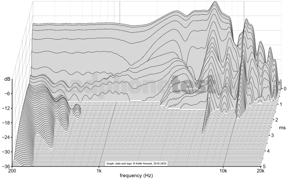
Figure 1 - HTL waterfall for the Sennheiser HD 800 S (left capsule)
By contrast, some of the CSD plots accompanying the RTINGS article (not reproduced here for copyright reasons) appear to show multiple resonances from the same headphone in the range 1-7kHz. The truth is that these resonances are phantoms, nothing to do with the HD 800 S and certainly not indicators of supposed inherent failings of CSD analysis. Rather, they appear in the waterfalls because room effects are present in the impulse response. These should have been removed from the IR prior to deriving the CSD plots but were not.
Figure 2 below shows a zoomed section of the RTINGS impulse response, covering a period of 10ms from just before the initial peak (red trace), overlaid on the same section of one impulse response obtained during HTL’s measurements (blue trace). In both cases the main peak of the impulse is normalised to a value of 1. To the left of the traces we see the decay of the HD 800 S’s response, followed in the red (RTINGS) trace by a burst of energy indicative of a room reflection that begins at a delay of 4.6ms. This is absent from the blue (HTL) trace because the headphone measurement is here arranged to postpone the arrival of room reflections to 10ms and beyond.
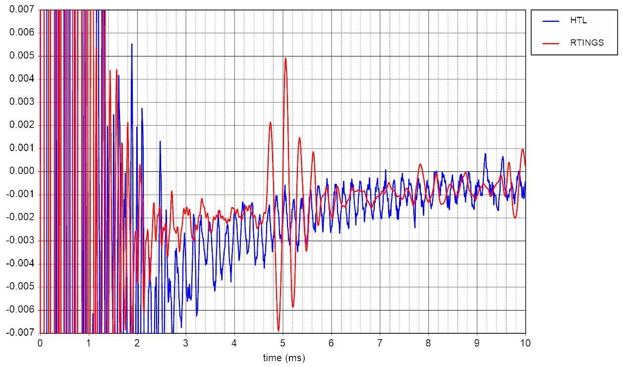
Figure 2 - overlaid impulse responses
No attempt will be made here to reproduce RTINGS’ CSD plots exactly because it is not necessary. The effect on a CSD plot of not removing the room contribution can be adequately demonstrated using HTL’s standard CSD waterfalls, even though they use smaller amplitude and time ranges than the RTINGS ones.
Figure 3 below shows the result of processing the RTINGS impulse response with a (rectangular) window width of 4.6ms, all values of the impulse response beyond this time being set to zero. The CSD plot is broadly similar to the HTL equivalent, but the frequency resolution is approximately halved by the reduction in window length from 10ms (in the HTL plot) to 4.6ms here. (The angled ridges at low frequency should be ignored: they are an artefact of the time windowing process.)
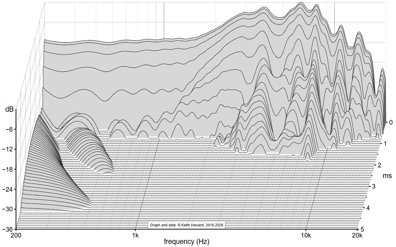
Figure 3 - CSD from RTINGS impulse response, time window 4.6ms
Figure 4 below demonstrates what happens if the CSD analysis window is lengthened to 10ms but IR values are not set to zero from 4.6ms upwards to remove the room contribution. Spurious ridges, caused by the room contribution, appear to show a cluster of resonances in the range 3-4kHz. These features – similar to those which appear in the RTINGS waterfalls but less fully deveoped because of the higher CSD floor and shorter time axis – are artefacts caused by inclusion of the room contribution. They are not indicative of the behaviour of the HD 800 S, nor are they indicative of inherent problems with CSD analysis. They are caused, simply, by a failure to implement the analysis correctly.
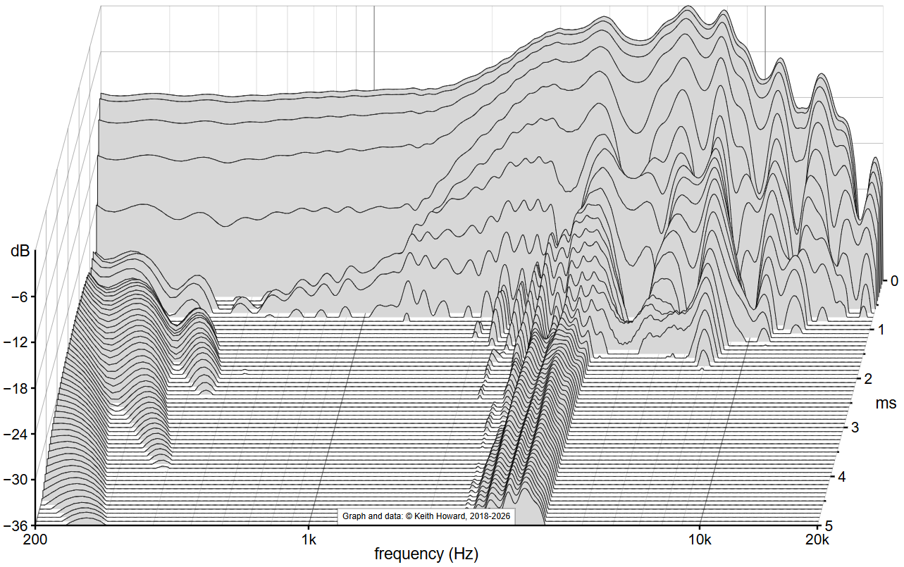
Figure 4 - CSD from RTINGS impulse response, time window 10ms
To be clear: CSD analysis is just as well suited to the assessment of headphones as loudspeakers, provided that appropriate analysis parameters are chosen and room effects, if present, are first removed from the impulse response. It is true, as outlined in the RTINGS article, that resonances have effects on frequency response but this does not make the CSD plot redundant. You might as well argue that frequency response is redundant because it is represented in the impulse response; it is, but is far from amenable to visual interpretation. Frequency response clarifies frequency-domain behaviour; CSD analysis clarifies resonance behaviour. It is perhaps also worth pointing out that the device under test’s frequency response is displayed as the first (time 0) trace of the CSD!
A few other issues
I have more general criticisms of RTINGS CSD plots which it seems appropriate to air here, as we’re on the subject.
1) Choice of CSD axis ranges affects the ease with which features of the waterfall can be identified. My judgment is that a time range of 5ms and amplitude range of 36dB are about optimum for the majority of headphones. It also assists interpretation if each waterfall is normalised to a peak amplitude of 0dB.
2) I find that the application of a colour map to a waterfall actually makes it more difficult to discern its features. This is why HTL’s CSD plots are resolutely greyscale.
3) Even if colour mapping of a CSD waterfall is considered desirable, there are well-established reasons not to use a Jet-like colour map as in the RTINGS plots. This issue is explored in more detail below, in what readers of HIFICRITIC may recognise as having been adapted from part of an article I wrote for the July/Aug/Sep 2022 issue in which colour mapping of X-Y plots was used to visualise the spaciousness of music recordings’ stereo imaging. This excerpt explains why, for various perceptual reasons, a Jet-like colour map is about the worst that can be chosen.
Colour Mapping
The use of colour to enhance images – be they graphs or photographs – is nothing new. You’ve probably seen it used to pick out details in astronomical or body scan images, while in the hi-fi context you may have seen colour used in spectrograms to represent signal amplitude in two-dimensional plots of time (on the horizontal axis) versus frequency (on the vertical axis).
You’ve perhaps not given much thought to the colour map (the transformation from data value to colour, via either an algorithm or a look-up table) that’s used for this, but in recent years there has been considerable attention paid to the topic. Ideally a colour map should be perceptually even (with no banding or sudden colour transitions), be of equal brightness (luminance) throughout, and not give anomalous results when viewed by people with the most common forms of colour blindness (better termed colour vision deficiency, since a total inability to see colour is rare). The last requirement is, or should be, of obvious importance given that up to 1 in 12 men have red-green colour blindness (whereas only 0.5 per cent of women are affected because the condition is sex-linked, the mutated genes being on the X chromosome).
Some of the oldest, most familiar colour maps are bad performers in at least one, and sometimes all three respects. A prime example is Jet (Figure A below) which until quite recently was the default colour map in Matlab (mathematical software with signal analysis functionality widely used by audio academics). In showing you different colour maps here I’m dependent on accurate colour rendition on your computer screen, but you should be able to see at a glance that Jet is not perceptually uniform. There is obvious banding in the light blue and yellow, and rather sharp transitions to the darker colours at either extreme. Less obviously (unless you are colour blind), it also fails the third criterion because it includes both greens and reds, and the second criterion too: it is much brighter in the middle than at either extreme.
If you insist on using a colour map that mimics the visible spectrum, running from blue to red via green, then Turbo (Figure B) is a better option as it eliminates the banding – but it still has uneven luminance and is, obviously because it contains red and green, poorly adapted to colour-blind viewers. Whereas the other five colour maps illustrated here (Figures C to G) are examples of alternatives that have been designed to meet all three criteria, even if they look a little less spectacular.
There’s a neat online tool called Coblis (colour blindness simulator, here) to which you can upload images to visualise – as a normally sighted person – how they appear to those with various forms of colour blindness. Figure H, as an example, simulates what the Plasma colour map looks like to someone with the form of red-green colour blindness known as deuteranomaly (a disorder of the retinal M-cones). While the colours have changed, the map remains unambiguous and perceptually smooth.
 Figure A - Jet
 Figure B - Turbo
 Figure C - Cividis
 Figure D - Inferno
 Figure E - Magma
 Figure F - Plasma
 Figure G - Viridis

Figure H - Plasma as seen with deuteranomaly